A line graph in the Historical EPS widget shows the number of total events and the overall average EPS for sensors over the past 31 days. By default, as you hover over a point in the graph, a pop-up window displays this data for each day. For more granular tracking, you can view EPS data for each hour. To change the view to hourly data, move the toggle switch in the pop-up window to Day instead of Month.
The blue straight line on this graph shows your contracted EPS in thousands (K) of events. For example, 20.0k on this line means 20,000 events per second.
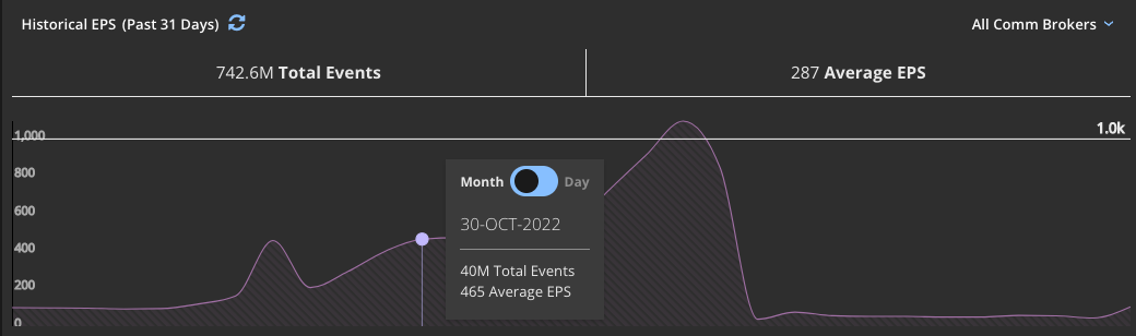
By default, the historical EPS for all sensors in your environment is shown. You can select a specific sensor from the drop-down menu in the upper right to see historical EPS information for an individual sensor.