This panel displays a graph that plots the rate (measured in mbps) of monitored traffic over the past 24 hours. The graph shows the total monitored traffic in red and shows individual traffic types in other colors.
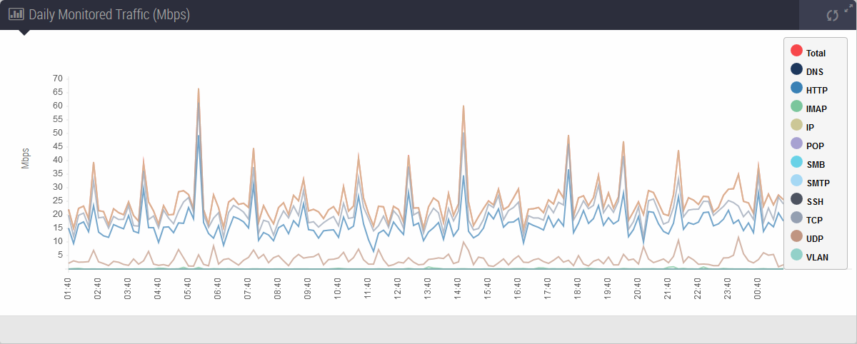
To filter out a traffic type, click its colored disc in the legend. The disc becomes a circle. In the following example, the graph shows only the total traffic and HTTP traffic.
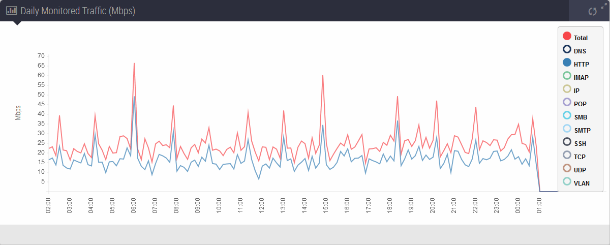
To stop filtering out a traffic type, click its colored circle in the legend.