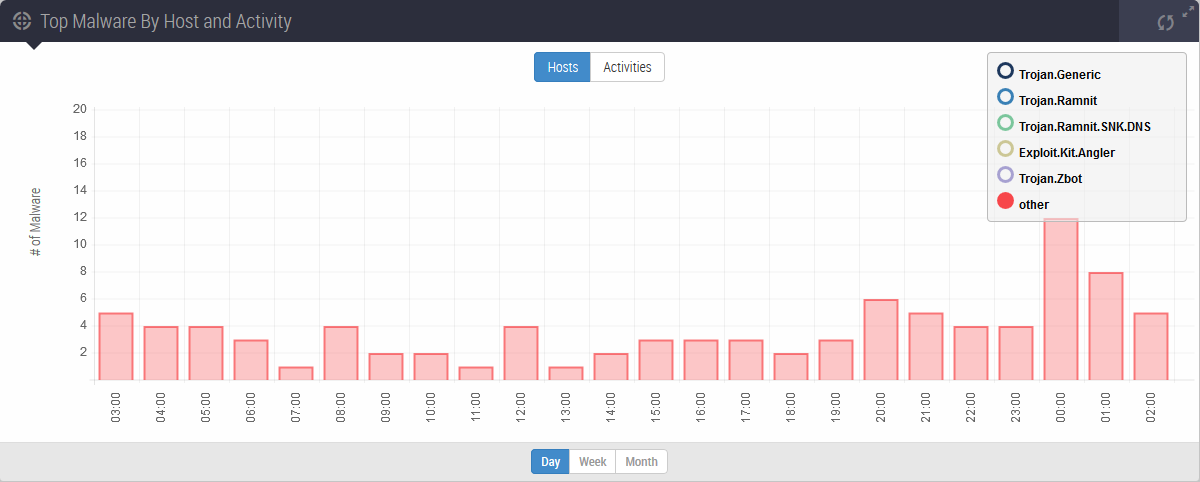
This panel contains a time series plot of the behavior of the top five malware categories detected in the monitored network during the past day, week, or month. For each of the top five categories, the graph shows either the number of hosts infected with the malware type or the number of detections of the malware type.
By default, the graph plots the number of hosts infected with each malware type during the past 24 hours. The following example shows a default view of the Top Malware by Host and Activity panel.
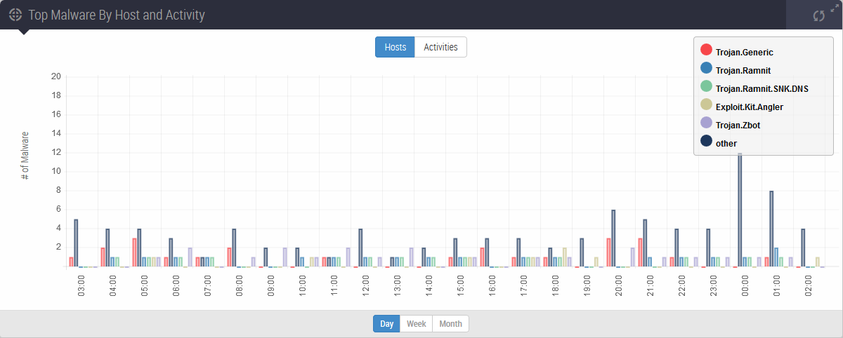
Use the controls located throughout the panel to adjust the data displayed:
Display infected host counts or malware infection count.
Change the period of time covered by the display (day, week, or month).
Show or hide any of the six malware categories.
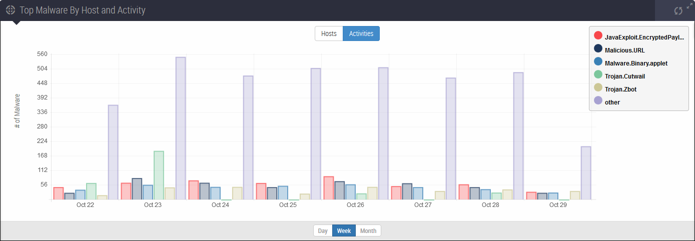
In this second example, the graph plots activity rather than infected hosts. The time frame is the past seven days rather than the past 24 hours.
Note
Changing the period of time graphed can change the top five malware categories.
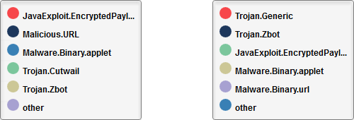
The following example legends are from two views the top five malware categories. The first legend is for a graph that covers the past 24 hours. The second legend is for a graph that uses the same data but covers the past seven days. The top five categories for the past seven days is different from the top categories for the past 24 hours.
To exclude a malware infection category from the data in the graph, click the color-coded icon in the legend. To restore the data to the graph, click the icon again.
In the following example, the graph shows only the uncategorized malware.